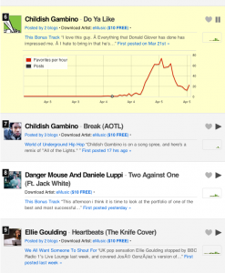
 What do we think of this then?
I have to say I’m not convinced. This graphs reveals the speed of favourites per hour, and subsequent blog posts. But does this add anything to the popular chart itself?
It’s a given that those appearing on this list will have a greater volume of ‘loves’ in recent days, as they become higher profile. All it takes is a few key posts from some of the better-known blogs on Hype’s roster, and the chart runs away with itself. It’s a self-fulfilling prophecy almost.
I can’t say I’m that interested, and I wonder if many other users will either. There’s nothing by way of an explanation on the Hype blog yet either, but maybe the team see this as a positive in a way that’s much less obvious to an outsider.